21 November 2011

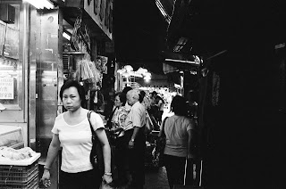
Notes of Hong Kong, by Hugh Wilson


Sometimes it’s the way the crowd flows, sometimes it’s a hidden glance, or a color, or feeling, or moment. Out on the streets all the information is there – a thousand times all the great artworks – richness, emptiness, movement, stillness, beauty – beauty frozen by the most perfect compositions, impossible compositions. It passes by me over and over again, in different forms and ways, ways I couldn’t have imagined. It passes by with the ease of itself: the greatest designers and artists have always strived for it – and in their best works they find it, or a closeness to it.

When I am present on the streets I cannot move my camera fast enough, the moments are gone. I start chancing the photos, shooting at random, on the in-between moments, the valleys between the peaks, the emptiness. For each moment of perfection there are hundreds, maybe thousands, of imbalance, I don’t count them. I wait, I wait, looking… there. and there. I’ve learned that when I point I should snap instantly, that my eye and hand are truer than my mind, faster, but it’s still hard to do. I am learning to trust my hand; trust is difficult.

‘My hand learned from my eyes,

my eyes learned from my heart,

and my heart learned from the Hua Mountain.’

- unknown ancient Chinese artist

I’m shooting 35mm film. I have to wait days for developing. When I pick them up I am excited like a child. I flash through them, so many are nothing, they missed, then I stop – I look twice and my eye begins to move over the image wanting to leave but stays. It doesn’t mean the image is beautiful or whole, is as perfect as what is out there, but it has some thing.

Hugh Wilson is taking a break in Hong Kong after 3 months painting on a remote pacific island. He paints entirely from life. www.hugh-wilson.com


20 November 2011

[notes on a ginkgo biloba carpet, fall]

This is the 3rd year that I've obsessively stalked a tree. Check out the darling of my attention this season--an ancient Ginkgo Biloba or Maidenhair tree--and you may also seek out a love interest in your neighborhood. Here in the RISD Museum's central courtyard, an ancient Ginkgo Biloba drops perhaps millions of florescent fan-shaped leaves in a couple of days, creating an ephemeral glowing carpet. How about that for phenomenological? Must hurry: leaves quickly brown if they're not swept off to dumps by maintenance crews first. Stalking a Ginkgo carpet is therefore necessary and very arguably worth it.


No one else seems to know about this tree, probably because it's mostly invisible from the street. Don't forget to look up. Our tree in October vs. November:


Why stalking is necessary: three days difference: 

Through a Japanese Maple to the courtyard a few days before the Ginkgo leaves fall:


A few of my studies of a Ginkgo over a year: 


Ginkgo Biloba trees are remarkable. They're considered living fossils with records dating back 270 million years. They have no living relatives. Clearly highly adaptable, they're also resistant to urban pollution which is unusual and makes them valuable in cities as a form of landscape infrastructure. Peter del Tredici, a great urban tree specialist, landscape architect, and ecologist, has written extensively on them. Check out the Harvard Magazine for more. Here's one of his images from a recent trip to discover naturally-occurring  Ginkgo Biloba species in China:
I've been reading recently that they're at risk of not being planted as widely in cities because of the smell of the fruit the female tree produces. How quickly people forget that our world is more than just a visually-occurring place. It would be an ecological and experiential loss to our world to stop planting this great tree.

13 November 2011

[notes on framed views]

Framing views is one of the oldest and best tricks in the book of design. Visitor becomes voyeur. Peering into a neighboring space, between screens and filters, inhabiting multiple places in one glance. Like a dance, our eyes crave to move rhythmically and then come to a point of rest before continuing. A series of framed views in a space guides our eyes confidently from one point to the next. Our imaginations are fed by a sense of mystery, wondering what is omitted from the frame, what lies behind a corner, or where a light source originates. We're hooked, engaged in a space, left wanting more. 
"Dog Day 88" Pen and Ink wash on paper by the author, San Marco Church, Florence Italy
Framed sky at the Baptista, Florence Italy
"Sky Wall" mixed media collage by the author

Islamic Paradise gardens are known for using framed views. Here courtyards and series of framed porticoes in Oman create ethereal light and sublime shadows:


Early Islamic map of Mecca

(Above) Binary window frame at L'Alhambra in Granada, Spain; Photo by Javier Carro
(Below) Courtyard  grove at Paradores L'Alhambra with box hedge, pen on paper, by the author


One of the most famous frames, ever. View to the Treasury at Petra, Jordan. The contrast of irregular natural rock formations to the geometric and symmetrical architectural form of the facade makes it even more remarkable:


I recently studied the work of Annette Hoyt Flanders, little-known landscape architect from the early 20th century. She was trained in the Beaux Arts tradition (think classical French gardens with box hedges). So while her designs don't look edgy, she was a master of creating outdoor living spaces and depth with her framed views. Below are some examples of this in her work and her travels to Europe from her slide collection at Smith College, never published before:
Annette Hoyt Flanders “The Descent to the Woodland, Lewis L Estate, Syosset Long Island
Annette Hoyt Flanders Century of Progress Exhibit, Chicago Symmetrical Box Hedges
Annette Hoyt Flanders Classic Garden Century of Progress Exhibit 1934
Annette Hoyt Flanders, Location and designer unknown 
Annette Hoyt Flanders, Parterre Garden, McCann Estate, Long Island
Annette Hoyt Flanders, Meadows from House Terrace, Oyster Bay, Long Island
Annette Hoyt Flanders, Location unknown, likely Italy
Annette Hoyt Flanders, Villa Gamberaia, Italy

10 November 2011

[notes on eileen gray, modern intuitive designer]

I'm embarrassed and shocked. That in my 31 years--surrounded by artists and designers, engrossed in art + architectural history classes at expensive art schools that I've never heard of Eileen Gray until this fall. Alas she was born into a man's era in 1878. She designed for 7 of the nearly 10 centuries that she lived. Imagine, such talent and diverse skill practiced for 70 years, pioneering the modern art movement yet without the education, mentoring, or recognition received by her peers: all because was a woman. 


Eileen Gray flanked by Le Corbusier and Jean Badovici


Eileen Gray's Rue de Bonaparte apartment, Paris
She was a gifted painter, lacquer artist, furniture designer, and architect (E-1027 in Roquebrune Cap Martin) whose influence was vast on the modern + art déco movements. I love that many of her designs are whimsical, sexy, funny, and simply beautiful. She had an unusual sense of atmosphere in her designs; an innate sense of negative space where a bowl or a chair or a room is inhabited by something or someone. 
That her publicly-known history is half gossip, and that she went largely unrecognized and unknown until recently is not surprising and unacceptable. The story goes like this: she was a contemporary and supposedly longtime unrequited love interest of architect Le Corbusier (who drowned while oddly swimming off the cliffs of her house in the French Mediterranean). He was and perhaps continues to be credited with many of her designs. 


The Dragon Chair was recently sold as part of Yves St. Laurent's collection for $28.3 million:

Dragon Chair Photos courtesy of Christie's

Nonconformist Chair
Transnat Chair

Transnat Chairs, Pair


She's perhaps most commonly known for her very modernist Bibendum Chair: 

Much of her work doesn't conform to the restrained army chant of modernists: "form follows function" (because sometimes design moves must be purely intuitive) like this lotus lacquered + tasseled table, benches, screens, and chaise longue below:


Rue de Lota apartment with her Pirogue chaise longue (also pictured below with lacquered screen)


Lacquered screen 
Wall painting at the house she designed, E1027 in 1926 for Jean Badovici

Dressing table
DWR should be ashamed that they only carry one mediocre modernist piece, a side table
Thanks to RISD professor, designer, chef Peter Tagiuri for introducing me to the intuition-driven work of this talented woman.
If you're interested in hearing my take on why it was she designed spaces so well, I'd be happy to elaborate. Thoughts?